Tag Archives: user interface

AINO Agile In Name Only – User Experience (UX) Epic Fail #3

When you’ve been part of digital marketing teams for a long time you see some dumb stuff. Large companies with middle managers who think they are experts on everything. I’ve worked with some experts, and ma’am, you are not an expert.

“We’re an agile team.”

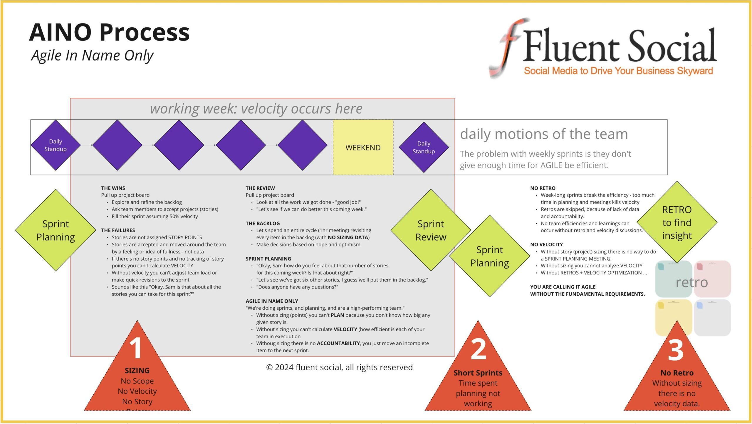
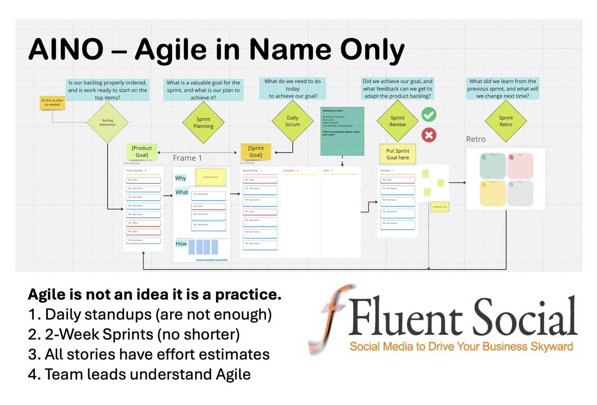
In this epic failure, a team tries an “agile framework” with many of the critical pieces missing. Agile is a well-mapped discipline that can guide a high-performing team. But, agile is a discipline. It requires experience, leadership, and authority. A newly minted “scrum master” from a Coursera or LinkedIn Learning certificate, has very little chance of guiding an agile team successfully. In this example, we see three massive failures of an inexperienced scrum master and their manager’s bravado.

The first failure is ONE-WEEK SPRINTS. This gives no time for velocity adjustments. Team members have multiple “agile” meetings across the week which kills their velocity/agility.

The second failure (more egregious) is the lack of project scope or sizing. With no story points it is impossible to do a sprint plan based on data. Sprint planning without points or sizing is called simple project planning, not Agile.

The final failure (resulting from the first two failures) is the lack of any RETROSPECTIVE. It is during the RETRO that scrum masters and leadership get to refine the process, optimize the team, and identify weaknesses in workflows or team abilities.

I give you a roadmap for AINO.

(Do not follow this map. The link below shows a healthy Agile map.)

Agile In Name Only - © 2024 fluent social, all rights reserved

If you are interested in looking deeper into this issue, here is a free ungated link to this Miro board where you can explore this map as it relates to a REAL AGILE PLAN.

MIRO: AGILE vs. AINO

As digital marketing consultants for some of the largest brands in tech, we’re invested in not letting this failure happen on your site or within your team.

Here is a document from Harvard Business Review on the importance of planning in Agile.

John McElhenney

The MegaMenu From Hell – User Experience (UX) Epic Fail #2

When you’ve been part of digital marketing teams for a long time you see some dumb stuff. Large companies with middle managers who think they are experts on everything. I’ve worked with some experts, and ma’am, you are not an expert.

In this epic failure in user experience, we see a company that paid for a well-respected vendor in the design and ux space, as well as a junior UI designer with a degree in graphic illustration. Despite obvious metrics and hotjar heatmaps showing incoming visitors were cycling in the bad megamenu design, the middle manager, and owner of the project, repeatedly dismissed internal team efforts to fix or kill these worst-practice megamenus.

Nielson Norman Group has a great article on Megamenus for Site Navigation, which was shared with the brash manager. Neither the metrics nor the supporting “best practices” data had any impact.

The problem is, even with experts on the team, all of them were YES MEN. Rather than upset the dark prince, they also ignored the incoming data. I guess that allows everyone to keep their job, the middle manager to keep his pride, and the site visitors to keep their obfuscated path to success. It does give more time on site and more interactions, as users open the terrible megamenus again and again, completely missing a second tier of the megamenu (the main failure) that contained the other 50% of the links they might have been looking for. This issue was announced and defined months before the launch of the website, as team members and stakeholder review staff could not locate the pages they wanted to validate.

I present the really bad megamenu UX failure.

megamenu epix UX fail #2

ref: Mega Menus Work Well for Site Navigation – Nielson Norman Group (the examples show the good and bad, clearly defining why the above illustration is bad.)

As digital marketing consultants for some of the largest brands in tech, we’re invested in not letting this failure happen on your site. Our next UX failure turns inside to AINO Agile In Name Only project management, which kept a middle manager happy, but provided zero agility.

See: Site Search Dumbed Down – User Experience (UX)

John McElhenney

Site Search Dumbed Down – User Experience (UX) Epic Fail #1

When you’ve been part of digital marketing teams for a long time you see some dumb stuff. Large companies with middle managers who think they are experts on everything. I’ve worked with some experts, and ma’am, you are not an expert.

In this epic failure in user experience, we see a company that paid for an ai-enhanced site search application. In the rush to build a new website, the full configuration was delayed.

The problem is, that the site search was still not configured a year later. The middle manager had experts on their team. They had vendors in design, ux, and ui. The main problem they had, however, was this: if all of your team are YES MEN and you begin to think you’re the smartest of everyone on your team, YOU might be missing a huge error. It’s possible your UX vendor understands the failure but is going along with your strong opinions.

I present the AI-assisted site search UX failure. One of the primary missing features “Identify search intent with AI” is now being heralded as a next-gen feature for websites.

User Experience Failure #1 - AI-assisted site search not configured

As digital marketing consultants for some of the largest brands in tech, we’re invested in not letting this failure happen on your site. Stay tuned for tomorrow’s failure: The Mega-Menu “Worst Practice” Example

John McElhenney